Class 8: CSS Layout
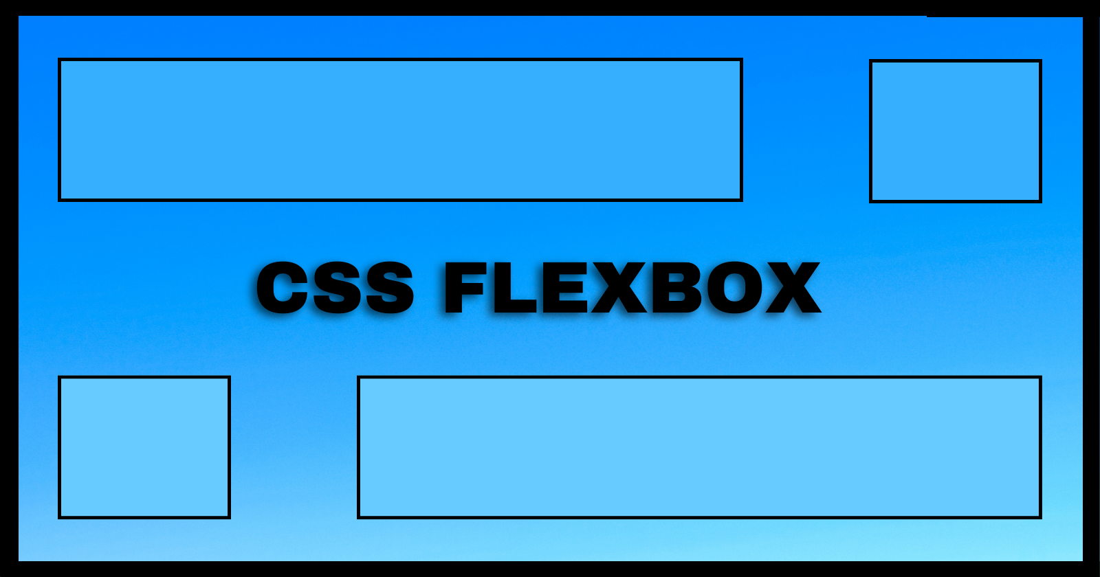
CSS - Flexbox
Flexbox is designed for one-dimensional content. Explain what this means
Flexbox is designed for one-dimensional content; meaning you can control the layout of a group of items in only one axis: the x axis (row) or the y axis (column).
Explain the difference between the main axis and cross axis
The concept of the main axis in flexbox refers to the value set by the flex-direction property, and it controls
the direction of the grouped items.
The cross axis, on the other hand, runs perpendicular to the main axis and controls the individual items in the group, allowing you to align the items with respect to the items and the flex container.
How can using certain properties of flexbox negatively impact accessibility?
Certain properties of the flexbox, such as row-reverse, can negatively impact accessibility due to the fact that
they only visually alter the viewport, but not the actual code structure. Someone using a screen reader could possibly
get the incorrect order of information.
CSS Layout - Flexbox
What are some advantages of using flexbox over float?
Some advantages of using flexbox over float are:
- the ability to vertically center content inside a parent element
- the ability to uniformly size content of different sizes inside a container
- overall, flexbox makes layout design much easier than using float
How does this topic connect with your long term goals?
This topic connects with my long term goals in that it makes me a better web developer; providing the tools and knowledge to design professional and aesthetically pleasing websites.
Things I want to know more about
Nothing at the moment.