Class 11: Audio, Video, Images
It is important for web developers to know how to add audio, video, and images in HTML for several reasons including:
- Enhancing User Experience
- Effective Communication
- Accessibility
- Content Variety
- SEO and Engagement
Knowing how to add audio, video, and images in HTML is crucial for creating compelling, accessible, and effective web experiences that cater to a broad audience and meet the demands of modern web development.
Video and Audio Content
Explain how the ability to use video and audio on the web has evolved since the early 2000s
The ability to use video and audio on the web has evolved significantly since the early 2000s.
In the early 2000s, video content was often delivered using Adobe Flash, a proprietary technology. Audio was typically in the form of simple HTML5 audio tags or, in some cases, Flash-based audio players. Quality and compatibility were major issues, and streaming was not as seamless as it is today.
In the mid to Late 2000s, HTML5 introduced the <video> and <audio> elements, which allowed native
support for embedding video and audio content without the need for plugins like Flash. This marked
a significant shift in the web’s multimedia capabilities, promoting open standards.
Today, WebRTC (Web Real-Time Communication) and the Media Capture and Streams API have enabled real-time audio and video communication directly in web browsers, leading to the rise of video conferencing and live streaming platforms. The HTML5 standard continues to evolve, and modern web technologies provide better multimedia support and performance.
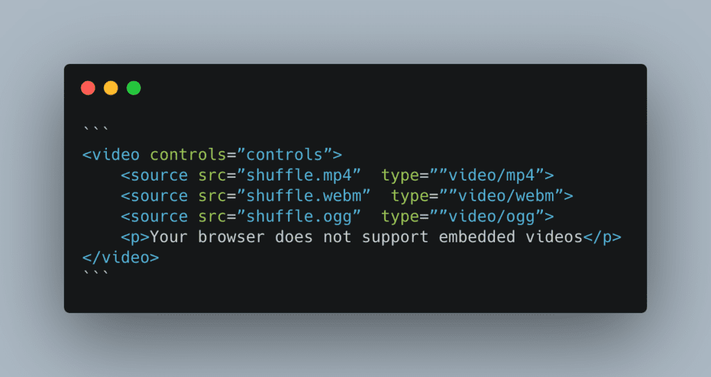
Describe the use of the src and controls attributes in the <video> element
The src attribute in the <video> element acts much like the src attribute in the <img> element:
it’s value contains the filepath to the video file.
The controls attribute provides the user with playback controls such as start, stop, and volume adjust.
Why is it important to have fallback content inside the <video> element?
The text content inside the <video> element provides what is known as the fallback content. This text
content displays if the video is unable to load (possibly due to browser incompatibility with the video format).
Write a very short story where <audio> and <video> are characters
Once upon a time in the digital kingdom, <audio> and <video> were best friends who loved to entertain the web’s
visitors. One sunny day, they found themselves in a heated argument. Audio, with a smug tone, said, “I’m the real
star here! My soothing tunes and catchy jingles steal the show. People can close their eyes and just listen to me.
What can you do, <video>?” <video>, feeling a bit pixelated, retorted, “Oh, Audio, you think you’re so clever,
but I bring life to the party! I’ve got moving pictures, action, and drama. You can’t capture the beauty of a cat
playing the piano or a sneezing panda like I can!”
The argument went on and on, with <audio> claiming that it could transport users to far-off places with just sound,
while <video> argued that it could make those places come alive visually. They bickered and brawled in the digital
kingdom until a wise web developer stepped in. The developer said, “Stop it, you two! You’re both essential to the web.
<audio> provides rhythm and melody, while <video> adds movement and storytelling. Together, you create engaging and
entertaining content. So, no more arguing!”
<audio> and <video> realized they were stronger together, and from that day on, they became inseparable,
entertaining web visitors far and wide.
A Complete Guide To Grid
How does Grid layout differ from Flex?
Grid layout and Flexbox are both CSS layout models. They differ in the following ways:
- Orientation:
- Flexbox is designed for one-dimensional layout, typically used for arranging elements in a row or a column. Excellent for distributing space along a single axis.
- Grid is designed for two-dimensional layout. It creates a grid of rows and columns, allowing you to position elements both horizontally and vertically. You can align elements in rows and columns simultaneously.
- Use Cases:
- Flexbox is ideal for organizing items within a container along a single axis, like a horizontal navigation menu or a list of items. It excels at centering and distributing space among items in a row or column.
- Grid is more suitable for creating complex, grid-based layouts. It’s perfect for designing web pages with multiple sections, aligning elements in both rows and columns, and creating responsive designs.
Grid container, grid item, and grid line are a few important terms to understand when using Grid. Please describe these terms in a few sentences
- Grid Container:
- The grid container is an element that serves as the parent or container for a grid layout.
- It is the element to which you apply the display: grid; property in CSS.
- All direct children of the grid container become grid items, and they are positioned within the grid defined by the container.
- Grid Item:
- Grid items are the immediate children of the grid container.
- They are the elements that are placed within the grid layout created by the grid container.
- Grid items can span multiple rows and columns, and their placement can be controlled using properties like grid-row and grid-column.
- Grid Line:
- Grid lines are the horizontal and vertical lines that form the grid structure within the grid container.
- They create the rows and columns that define the layout.
- Grid lines can be referred to using line numbers, such as
grid-row: 1 / 3;, which means the item starts on the first grid line and ends on the third grid line, spanning two rows.
Responsive Images
Besides making a site visually appealing across different screen sizes, why should developers make images responsive?
Developers should make images responsive for several important reasons. Beyond just making a site visually appealing across different screen sizes, responsive images can also optimize website performance for those different types of devices. Another reason for using responsive images is to maintain bandwidth efficiency. Serving appropriately sized images reduces the amount of bandwidth consumed, which is especially critical for mobile users with limited data plans.
Define the following <img> attributes srcset and sizes. Write an example of how they are used
How is srcset more helpful for responsive images than CSS or JavaScript?
The srcset attribute is used in the <img> element to provide multiple image sources with different resolutions or sizes.
It helps the browser select the most appropriate image to display based on the user’s device capabilities and screen size.
The sizes attribute is used in conjunction with the srcset attribute to specify the layout breakpoints and define the
image’s display size under different conditions.
The following is an example of use:
<img
  src="some-crazy.jpg"
  srcset="a-crazier.jpg 800w, even-crazier.jpg 1600w"
  sizes="(max-width: 600px) 100vw, (max-width: 1200px) 50vw, 25vw"
  alt="My Responsive Image With Different Sizes"
/>
Things I want to know more about
Nothing at this moment.